Tuesday, March 17, 2009

DMF Book


DMF Book Synopsis

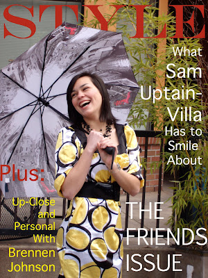
Posted above is my Final Project for Digital Media Foundations. I had a ton of fun with this project. When we discussed this project in class, I remembered Miles suggesting that we start by thinking of a book or illustration that we liked to look at and try to mimic it. Well, one of my guilty pleasures is looking at Vogue Magazine. I like it more for the artistic value of the ads than the actual fashions. So, I decided to take on the daunting task of mimicking ads from Vogue for my project. I asked some of my close friends if they would be willing to help me by modeling for the photos. I spent time flipping through magazines in order to get some basic ideas. I knew that my photos would not look nearly as professional as the ones in Vogue, but I was able to study the poses, backgrounds and text. I figured out which ads I wanted to use as a base for each of the friends that I was taking pictures of. After the photos were taken, I uploaded them and used PhotoShop to edit. Some photos needed very little editing, such as adding only a warming filter. Others were more complicated, like the cityscape layered ad or the extreme close-up ad. For the finishing touch I put text on the photos. I tried to mimic the look of the brand names in the ads, and instead of a brand I used the names or initials of my friends. For the cover, I used one of my photos and added a lot of text to make it look like a magazine cover. I encountered numerous problems with this project, but it taught me a lot about digital photography. I had to work around the schedules of my friends while trying to meet a deadline. For outdoor photos, I had to wait for weather that was decent enough to shoot pictures in. I sometimes had to apply make-up or adjust the hair of my friends, and they were nice enough to cooperate. For the indoor photos, I had to work with whatever lighting was available because I do not own professional lighting equipment. However, I felt good about overcoming each challenge, and I loved playing with the images in PhotoShop and InDesign. Thank you, DMF Professors, for a wonderful class!!

Saturday, March 14, 2009

Final Blog for DMF and Interactivity: Art Department Website

I took a look at the website for the Art Department at SOU and I can honestly say that I do not have many suggestions to make. I think that the navigation was easy and straightforward. I am not an Art major, but if I was I feel that I would have all of the information that I need right at my finger tips. I really liked the photos of the Art facilities, (especially with the ragged edge borders, it looks cool). It can give potential students an idea of where they will get to work if they take any Art classes at SOU. The only thing that I think would really add to the page is a photo archive of student work. Because I have gotten a chance to walk around the Art buildings, I have seen a lot of student work and there is some real talent in SOU's Art Department. I think that other people should have the chance to see it as well. It is a also something that could easily be updated on a regular basis so that many students are able to display their work online. This is really the only suggestion that I have. Otherwise it looks great!

Sunday, March 8, 2009

Whoops! Forgot To Do Visual Culture, Week 9. So, Here It Is!


Objects:
Eiffel Tower
Trees
Path
Governess
12 Little Girls
Sky
Title

This week we discussed our final project, which is to create a book. Some of the examples we looked at were children's book illustrations, which got me to thinking about some of the books I loved as a kid. This picture is the famous cover illustration from Madeline. It has a style all its own. I love the lines and how they look like sketches rather than perfectly drawn images. I think the style appeals more to children. It reminds me of some of the drawings are created in Interactivity because it looks like it was done quickly, but it is fun and colorful. The picture looks like it would be a great beginning for an animation, which is probably why the Madeline TV series was created. I also like that even though Madeline is small and not in the center of the picture, your eye is drawn to her.


Objects:
Mouse
Bear
Owl
Hedgehog
Rabbit
Badger
Fox
Mole
Mitten
Snow
Title
Wood Border

This is another illustration that I remember very clearly from my childhood. The story of The Mitten is very simple, and I think that most of the book's appeal is in the pictures. The author uses a style that makes it appear as if everything is painted on wood. All the illustrations for her books have the same rustic, wintry feel. Unlike the Madeline pictures, these are very detailed and carefully done. I think that, thought they are very different, both styles fit the respective stories that they accompany. Jan Brett is also very good at using her abilities to draw the reader's eye to the central theme of the story, which is the mitten. It is placed at the center of the photo, and all the animals are looking at it, so the reader's natural instinct is to look at it too. Even without the title, you can get an idea of what the book is about.

Tuesday, March 3, 2009

Interactivity Final Project

I have already begun work on my final project for Digital Interactive Studio, but I thought I would blog a bit about what it should be like when it is finished. It is going to be a music video using two characters: a bird and a squirrel. The music video will tell a story about the two characters going through a breakup. Interactivity is included because the viewer will be able to click on buttons throughout five different scenes. This idea came from two different sources. The first was a music video that two friends of mine put together. The video is pretty funny, and I wanted my final project to be more entertaining than my midterm. I am even using the same song that my friends used in their video. My ideas about how to make this project interactive came when I received an e-card for my birthday from my aunt and uncle. I thought that it was fun because I did not just click "play" and watch the card. It gave me prompts to click on certain objects in the screen in order to keep the card going. I liked that I had to be interactive in order to view the entire card. That's what my project will be like. In order to see the entire movie, the viewer will have to stay active in what he/she is watching.

Sunday, March 1, 2009

Ashland Independent Film Festival (For DMF and Interactivity)

This week we had an assignment to blog about the guest speaker from the Ashland Independent Film Festival. Unfortunately, I had class during the time that the guest speaker came to SOU, so I rented an Independent Film from the Ashland Festival from DJ's video. There were only two choices of films so I went with one called Joyful Partaking. It is essentially about a neighborhood of people, all of whom are unhappy with their lives for one reason or another. Examples include a middle-aged man who is suicidal due to the untimely death of his son, a middle-aged woman who is incredibly lonely and has only a dog for company, a young married couple (wife subjects to infidelity because her husband is uncomfortable with having sex when his mother just moved in with them), the mother-in-law of the unfaithful wife, who has recently suffered a stroke and has difficulty walking and talking, and a family that includes an out-of-work father, a frustrated mother, a daughter who chooses to work instead of go to school, and a son who is brilliant as well as bullied. The film jumps from one situation to another, and tells the stories of the individual breakthroughs that are achieved by each person. There is a spider who travels throughout the neighborhood and is seen in many different scenes. The spider keeps attempting to build a web and is has his web repeatedly broken. The spider, which is symbolic of the attempts that each character makes to better his or her own life is reminiscent of the turtle in the famous Grapes of Wrath. It ties the characters of the neighborhood together. While the ideas for this film were not necessarily completely original, I was still impressed. Some of the acting was quite effective, and the message was a positive one. The low budget did not hold back the creativity and power of some of the scenes. It reminds us that, even in times of despair, the kindness of one person can turn someone's life around. I believe that this film was presented in the festival a few years ago, but it encourages me to attend the next Film Festival in Ashland if I have the opportunity.

Tuesday, February 24, 2009

Table of Contents


This is my Table of Contents project for DMF. I did what I could to replicate the example on our class blog, but I know that a couple things are different. I searched thoroughly and could not find the exact same fonts that were used, so I found similar ones. I used text edit to make it look as similar as I could, by doing things like adjusting the spacing between letters and the height of the letters. I also used different images for the boxes. I think this adds a bit of my own flare to the project.

Sunday, February 22, 2009

Visual Culture 2, Week 7


Objects:
Guitar
Tree
Roots
Sky
Clouds
Mushrooms
Fish
Egg
Treble clef with wings
Mountains
Records (hanging from the tree).

This image caught my attention because of its musical inclination. I am a Music-Business major, so, of course, a huge guitar is something that catches my eye. I found this also in a search for desktop wallpapers, but I think that this piece could exist on its own as abstract art. The tree reminds me of the one used in the logo for the film Big Fish. To me, the image represents the unearthing of new music and the growth/evolution/journey that is continuous for all types of music. Because of the mountains and earth coming from the guitar, it makes the point that a person who is passionate about music can make music his/her entire world. Once the viewer of this art takes in the enormity of the guitar and the tree, the eye moves upward to the treble clef that has hatched from an egg in the tree and taken flight. While studying this piece, I also noticed the isolation of the image. Despite the giant size of the guitar, it floats in the middle of space with nothing but clouds to surround it, and one small treble clef floats above it all. Nothing else matters but the music and the life that is a result of music.

Visual Culture 1, Week 7


Objects:
Trees
Bird
Person climbing
Person diving
Person on hill
Bathroom sign people
Color stripes
Sun rays
Cloud shapes
Abstract graphics

Today I was looking at images that are meant to be used as computer backgrounds. I change my computer wallpaper frequently, and it got me to thinking about how the need for a wallpaper on a computer desktop has opened up a window for a new kind of art. This was one of many backgrounds that appealed to me. I was attracted to the color combination of the three stripes (green, red and dark grey) against a fairly neutral background. I noticed that the green stripe creates a hill which appears to have a distant sun behind it, and the sun is issuing rays across the image. Even though this piece is abstract, there is a definite light source. I think the use of trees as silhouettes adds interest to the art, along with the scattered images of people. I was amused to see the figures in the bottom right corner that usually appear on bathroom signs. I don't know why they are there but, once again, it adds interest.

Wednesday, February 18, 2009

Midterm Project

Advent Calendar

Interactivity


A couple classes ago in DMF, we were discussing movie posters, and an example was President Obama's campaign poster (HOPE lithograph). It turns out that there is a website you can go to and make a similar poster using any photo you want. I decided to visit this website and play around a little bit. One of my friends, Gabby, is a redhead and a bit crazy, and she is constantly telling people that they are dumb. So I took an awesome photo of her and uploaded it on the Obamicon site, then used the slogan "You're Dumb" on the bottom. What a highly entertaining interactive site! I posted the final product on Facebook and got numerous comments about it. The interactivity of the site is simple in that all it really does is adjust the colors of a photo to dark blue, sky blue, cream and red to make it look like the Obama posters that we all recognize. Even though anyone can easily use it, I now have other people asking me to use their photos to do the same thing!

Saturday, February 14, 2009

Visual Culture 2, Week 6


Objects:
Masked Man
Female
Crowd of People
Light Beams
Title
Film Credits

I had never seen this particular poster for V for Vendetta before, but I love it. I think that it should have been used more for the advertising. I have unfortunately only seen the beginning of the movie, but I think that this art captures the essence of the film. The colors are strong and bold, in addition to being ominous. I notice the same characteristics that we talked about in class such as creating lines that move on angles and making artwork out of the lettering. The title stands out, as well as the tag line "Freedom! Forever!." I think that the way the characters have been altered to look more like cutouts is effective in that it adds drama to the image. I also enjoy the overall vintage style of the poster and I think that posters should be designed with a vintage flavor more often.

Friday, February 13, 2009

Visual Culture 1, Week 6


Objects:
City
Man
Title
Searchlights

This week I was looking specifically for vintage movie posters, since our assignment is to create a movie poster. This was the first one that caught my eye. I noticed how the text is not just a title, but also part of the artwork. I was first drawn to the city in the center because of the light issuing from it, then to the title which is made using a unique font, and then to the man carrying the city on his back. The background is very simple, and the use of mainly yellows against the black create a luminous quality. There is light issuing from the city, and also focused on the man's face and torso front. I like how the searchlights from the top of the tallest building lead into a semi-circle that pushes the eye back up to the title. It is a very effective technique.

Tuesday, February 10, 2009

Movie Poster


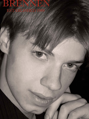
This is the final copy of my movie poster design. My boyfriend, Brennen, is playing a part in a full-length feature that is being produced by theater students of SOU. The film is called Ambivalence, and I only knew a few things about it when designing the poster. It is about a man who is working at Blockbuster and is very unhappy with his life. It has a dark aura because the main character is very depressed and living in a filthy apartment. He only pursues another life at the very end of the movie when he leaves for Hollywood. The main prop in the film is a DVD of his acting monologues. This was the information that I used to create the layout. I knew I wanted Hollywood in the background to represent his dream of a better life. I tried to use techniques that we discussed in class such as splitting an image down the middle, and creating angled lines instead of straight horizontal/vertical ones. This is why I skewed the Hollywood image in an angle and why I cut the image of the man down the middle. I used the artistic filter to make the image of the man look more like a drawing. I used a half-and-half color overlay of blue and yellow on his face to represent Blockbuster. I added the image of a DVD because I knew that it was important to the plot. There was some empty space in the bottom right corner and upper left corner of the canvas, so I decided to add another color to the theme. I chose a blood-red tone to help set the mood of the film. The final portion was the title, which I had the most difficulty with. I wanted it to really pop. I chose a very geometric font to contrast with the Hollywood sign. I stuck with the blood-red color to accent the color scheme. I then added an outer glow to the letters, which complimented the yellow overlay on the man's face. I still thought that the title could pop out a bit more, so I tried to put a rectangular background behind it, but then the poster started looking a bit too geometric. I decided that I was at the point where messing with it more would take away from the image instead of adding to it. I chose to leave it alone, which was difficult for me because I often feel that I can make something better if I just tweak it some more. However, I am satisfied with the final product.

Monday, February 9, 2009

Collage Revisited


This is my revised copy of my collage. Originally, I got the idea for this when looking at example blogs and finding the Marylin Monroe collage. I am an Audrey Hepburn fan, so I thought it would be fun to take that idea and do something similar. However, my intent was to focus on Audrey in her own personal life instead of her screen characters. I chose photos like the one of her on a bicycle and carrying a child during her work for UNICEF because those represent the person that she really was. I recently read her biography which taught me much more about the non-Hollywood Audrey. I learned that she loved gardens, which is why I chose a background that included flowers and trees. The first time I posted this collage, there were a few things that I was unsatisfied with. I have now gone back to adjust them, and this is the final product.

Saturday, February 7, 2009

Visual Culture 2, Week 5


Objects:
Woman
Pictures of meat
Japanese or Chinese writing (not sure which!)

I was interested to find that upon doing a Google search for collages I came across many of the type that we discussed in class as being "not very good." A majority of them were just a series of rectangle pictures that were cut and pasted together. Then I found a site for the artist of the above work. I like all of his collages, but this one was my favorite, mainly because of the color blocks and interesting images that he used. It doesn't make sense to me at all, but I'm pretty sure that is part of it. I found my eye drawn first to the word exercise strewn across the top, and then to the female in the middle who seems to have attained an extra set of legs and arms. Then I started to notice more of the detail, such as oriental writing symbols and pieces of meat around the edges. I enjoyed wondering what in the world was going on in this image, and it kept my attention for a significant amount of time.

Visual Culture 1, Week 5


Objects:
Doors
Windows
Floor

This week I was looking specifically for collages that were interesting to me. We are working on our own collages right now in DMF, so I wanted to see other work that is out there in the world. I think this one caught my attention originally because of the gourd shape. When working on my own collage, I only ever thought of using a rectangle as the canvas shape. I was also really attracted to the bright blue coloring in the center, which is the part that really draws in the eye. I find it interesting that the layout is set up like a reflection, but the bottom is a different image from the top. It made me think of Alice falling through the rabbit hole to come out upside-down in another place. Even though there are two distinct images, I think that they work well to create a new art piece because of the way that they are each broken up and then connected to each other. It is appealing as a single piece of art.

Wednesday, February 4, 2009

Goals for DMF

I have recently posted both the Picturing the Other assignment and the Collage assignment, but I consider them both to be first drafts. Yesterday in class, we talked about how to adjust a photo to remove unwanted shadows. As soon as I have time, I will head to the lab to work on Willy's photo and taking the shadow off his face. I am fairly happy with the collage, but I still want to adjust a couple things. I did not intend to leave the canvas visible so that there are white borders, so I need to remove those. I want to take the eyes and feather the edges a little more. I also want to do the same with the figure of Audrey as an angel. That way, the transition between the cut out images and the background will be a bit smoother. Finally, I would like to try and use the clone stamp tool to put grass in the middle of the bicycle wheel so that it looks a bit more like a new picture rather than a cut-and-paste. Hopefully I will get to all these changes this week. I am writing them down now so that I will remember everything that I want to work on.

Goals for Advent Calendar

I have been working hard on my advent calendar, and I have gotten it to where all of the buttons function in a way that makes sense, hoorah! Now I really want to make it look nice. I plan on adjusting the animations so that they are longer and more fluid. I also would really like to add sound so that music plays each time one of the Mickey doors is opened. I am excited to take the functional calendar I have created and make it look really good!

Tuesday, February 3, 2009

Saturday, January 31, 2009

Picturing the Other


This is my first attempt at the Picturing the Other assignment. The above is a photo of Willy. I met Willy today on the playground at Lithia Park, and asked his dad if I might take his photo. He was a very cheerful, but somewhat shy subject. His dad tried to get him to smile, but I think that the half-smile in this photo captures Willy's personality a bit better. I had a couple problems when shooting. The first and main one was the shadowing. Today I set out to take some pictures thinking that it would be fun on such a sunny day. I forgot that overcast days can be much more helpful when taking pictures. I would have liked to put Willy in a different place, but his father seemed intent on letting him play freely. I loved that he was in a natural setting, but the shadows are pretty drastic, especially the one that crosses his face. I tried to work with it on my own in Photoshop, but I will need some help in lab. I also had some trouble with the shutter speed on my camera. This is the first digital camera I have owned, and I am still getting used to it. I bought it for DMF, because I did not already own one, so it is taking some adjusting on my part. In the short time that I had with Willy, I took a few pictures, but many of them were incredibly blurry, so this is the only one that I really had to work with. I feel like there are so many things that I still need to learn about my photographer's eye in order to create a photo that tells a story while keeping in mind lighting and positioning and doing it all in a short amount of time if necessary. I did like that, in Photoshop, I was able to adjust the background so that Willy stands out more. I still feel like the picture could use some tweaking though. I would also like to try taking some more pictures with different subjects so that I can work on my camera skills.

Wednesday, January 28, 2009

Visual Culture 1 & 2, Week 4


Objects
Bridge
Sky
Clouds
Cars
People
In DMF this week, we were discussing hue, saturation and value. I went searching specifically for an image with high value contrast and found the above photo. I was drawn into it by two things: the high contrast of the silhouette against the sky and the point of view used in order to achieve fantastic lines. All of the lines draw the eye right to the top center of the tower and it makes you feel like you are standing right there beneath it. With the direction of the light coming mostly from one side of the frame, the bridge has a very majestic feel. I also like that, while cars are included, the street is not the focal point of the picture. Also, the camera was tilted a bit to add interest to the lines of the tower while nothing has been done to draw too much attention to the activity that is actually on the bridge.

Objects:
Building (temple)
Bridge
Close-up branch
Distant trees
Sky
Water
My next search was for a photo with a specific hue, and I found the above. Obviously it has been adjusted to contain mainly a yellow hue, which contrasts nicely with the black. The light seems to be issuing from the building itself. That, in combination with the fact that the building is placed at the center of the photo, draws the eye immediately to the building (which I think is a temple of some kind). Then, the audience may allow the eye to wander, and notice the reflection of the building and the lovely silhouette effect of the branch in the foreground. This photo reminded me a lot of one that I posted earlier with sailboat in it that has a mainly blue hue. To me, the yellow hue conveys excitement. It seems that the world outside the building is dull and black, but a whole new world awaits once you enter it.

Tuesday, January 27, 2009

Alphabet Soup, Edited


Last week I posted several letters for my alphabet soup project. However, I had not really done much to adjust them to make the letters stand out more. Today I picked my five favorites and worked with them in Photo Shop. I mainly used adjustment layers to change the contrast, hue, saturation, and lightness. I also used the curves layer on a couple of them to adjust the contrast to a higher extent. I think the photos are more appealing now and also have more of an artistic flavor. I also feel that playing around with layer adjustments in this project will help me when I begin to work on the next assignment, Picturing the Other.

Monday, January 26, 2009

Interactivity and Pixar


The other day I was exploring the Pixar website. Pixar is a company that I greatly admire and I like to keep myself updated on their projects. I clicked on a link to see the movie trailer for their upcoming film UP. I was impressed simply by the UP homepage. It took a while to load, but there was a nifty little animation. There was a sky background and a house with balloons attached to it that floated up and down across the page. I noticed the detail of the house and how the balloons would shift to indicate the effects of the wind. Then, at the bottom there was an option to view either the trailer or the teaser. A compass was placed in between the two options, and when you moved the cursor, the compass would change direction. This to me was an example of how simple interactivity can be very pleasing. I kept moving my cursor back and forth just to see the compass move, knowing all the time that it would do the same thing. It was just so darn entertaining! Life really is all about the simple pleasures...

Tuesday, January 20, 2009

A New, Not So Fun, Place

Last week I got to go to see a new doctor for the first time. It was not for anything serious, but I am graduating next year and I thought it might be good to start seeing a regular doctor in town since the school heath center will no longer be available to me. My first time going to the doctor's office was rather nerve-racking. There is no reason it should have been, I think it is just part of going to the doctor. Once again, I found that being in a new place greatly increases my awareness of surroundings. I also think that when one is at the doctor, one tries to avoid looking at the other people there because it somehow seems rude or nosy. As a result, one struggles to look anywhere around the room except at the other people. I noticed the typical use of green walls (green is supposed to be calming) and the very clean carpet. I also took note of the fake plants and the variety of magazines strewn across the end-tables. Basically a typical medical waiting room. There was also a kind of nervous energy circulating through the area, which is something interesting about being in a place that you do not want to be and knowing that no one else (except the doctors) really want to be there either. The office itself was not aesthetically unpleasant, but, all in all, I was not unhappy to leave.

Visual Culture Weeks 2 and 3


I realized that I forgot to post some comments on visual imagery last week for DMF, so I am including extra images this week.
Above photo:
Big oak tree
Leaves
Grass
Lake
Sky
Distant mountains
Sailboat
This picture originally caught my attention because of the tranquility it suggests. It is a photo that was taken and then adjusted using Photoshop. The eye is immediately drawn to the boat for a few reasons. First, an area of light surrounds the boat, which creates a silhouette. Also, the boat is more or less at the center of the photo. Finally, the boat is the only real object in a very natural setting. I love how the giant oak tree creates a heavy frame, as if offering protection for the serenity of the view behind it. I appreciate that the only colors are a variety of blue shades. I also like how the blades of grass all move in one direction to show the invisible wind that moves the boat along the glassy lake. All in all I find this picture to be very calming.

Objects:
Pupil
Eye
Eyelid
Scales
My first reaction to this photo was actually "gross" but I decided to take a moment to study it, and I started to realize its beauty. Obviously this eye belongs to a reptile of some kind. I feel that the eye of a reptile can be quite alarming, especially in this magnitude. I believe this is mainly due to the fact that the pupil is a slit instead of being round, and the shape is associated with something more demonic than a normal animal. Yet I love how the sharp jagged edges of the pupil, along with the pure black color, contrast with the marbled yellow of the eye itself. I like how the small reflection of light in the eye is the only indication of a spherical shape. Once a viewer focuses on this picture, it is difficult to look away; it is almost hypnotic. The photographer chose an animal with orange and white coloring instead of green, which I think adds to the intensity of the piece. The orange scales surround the eye and move in a spiraling direction, which really adds a certain kind of depth to the picture.


Objects:
Child
Wood wall
Brick wall
Sidewalk
As I continue to write about visual imagery, I realize that the pictures with the fewest recognizable objects in them tend to be the ones that are the most appealing. I just love the above photo...the kid is so charismatic without even saying a word. Using the rule of thirds, his face is placed in the right spot to draw the eye in. His body positioning is great because, while it is a pose, it says something about his personality. The best part is the way he holds his fingers in a peace sign, in a perfect way of creating a small frame below his eye. The audience would already be drawn to his eye, but the peace sign completes the attraction. The gesture, in combination with the lack of a smile says to me "I got attitude, and life is cool."

Objects:
Butterfly
Sky
Clouds
City
Buildings
Skyscraper
Another photo that has probably been through some Photoshop adjustments. Of course, the transparent butterfly was the first thing to grab my attention. It is placed at the center of the photo, and the dramatic lines of the wings against the busy background make it a good focal point. I like how the bottom of the wings have retained some color, and I wonder how the artist achieved that specific affect. I also like that the cityscape background has a fishbowl effect on it, so that you see the city more through the eyes of the butterfly than the photographer.
Monday, January 19, 2009

Alphabet Soup


For this project I was hoping to capture the entire alphabet. However I have been sick recently and not inclined to go out searching too much. Hopefully I will be able to continue to add to what I already have. I liked that the project allowed me to look at objects I do not normally pay attention to. I found that, even when I did not have my camera with me, I would slow down my walk and be looking for the letters anywhere that I could. This project forced me (in a good way) to take the time and opportunity to be more observant.