Tuesday, March 17, 2009

DMF Book


DMF Book Synopsis

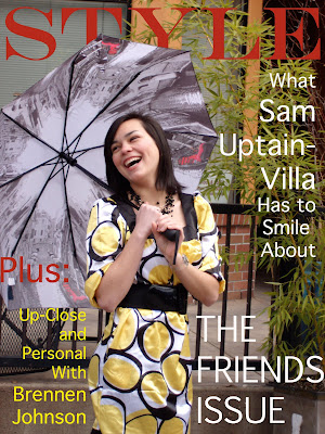
Posted above is my Final Project for Digital Media Foundations. I had a ton of fun with this project. When we discussed this project in class, I remembered Miles suggesting that we start by thinking of a book or illustration that we liked to look at and try to mimic it. Well, one of my guilty pleasures is looking at Vogue Magazine. I like it more for the artistic value of the ads than the actual fashions. So, I decided to take on the daunting task of mimicking ads from Vogue for my project. I asked some of my close friends if they would be willing to help me by modeling for the photos. I spent time flipping through magazines in order to get some basic ideas. I knew that my photos would not look nearly as professional as the ones in Vogue, but I was able to study the poses, backgrounds and text. I figured out which ads I wanted to use as a base for each of the friends that I was taking pictures of. After the photos were taken, I uploaded them and used PhotoShop to edit. Some photos needed very little editing, such as adding only a warming filter. Others were more complicated, like the cityscape layered ad or the extreme close-up ad. For the finishing touch I put text on the photos. I tried to mimic the look of the brand names in the ads, and instead of a brand I used the names or initials of my friends. For the cover, I used one of my photos and added a lot of text to make it look like a magazine cover. I encountered numerous problems with this project, but it taught me a lot about digital photography. I had to work around the schedules of my friends while trying to meet a deadline. For outdoor photos, I had to wait for weather that was decent enough to shoot pictures in. I sometimes had to apply make-up or adjust the hair of my friends, and they were nice enough to cooperate. For the indoor photos, I had to work with whatever lighting was available because I do not own professional lighting equipment. However, I felt good about overcoming each challenge, and I loved playing with the images in PhotoShop and InDesign. Thank you, DMF Professors, for a wonderful class!!

Saturday, March 14, 2009

Final Blog for DMF and Interactivity: Art Department Website

I took a look at the website for the Art Department at SOU and I can honestly say that I do not have many suggestions to make. I think that the navigation was easy and straightforward. I am not an Art major, but if I was I feel that I would have all of the information that I need right at my finger tips. I really liked the photos of the Art facilities, (especially with the ragged edge borders, it looks cool). It can give potential students an idea of where they will get to work if they take any Art classes at SOU. The only thing that I think would really add to the page is a photo archive of student work. Because I have gotten a chance to walk around the Art buildings, I have seen a lot of student work and there is some real talent in SOU's Art Department. I think that other people should have the chance to see it as well. It is a also something that could easily be updated on a regular basis so that many students are able to display their work online. This is really the only suggestion that I have. Otherwise it looks great!

Sunday, March 8, 2009

Whoops! Forgot To Do Visual Culture, Week 9. So, Here It Is!


Objects:
Eiffel Tower
Trees
Path
Governess
12 Little Girls
Sky
Title

This week we discussed our final project, which is to create a book. Some of the examples we looked at were children's book illustrations, which got me to thinking about some of the books I loved as a kid. This picture is the famous cover illustration from Madeline. It has a style all its own. I love the lines and how they look like sketches rather than perfectly drawn images. I think the style appeals more to children. It reminds me of some of the drawings are created in Interactivity because it looks like it was done quickly, but it is fun and colorful. The picture looks like it would be a great beginning for an animation, which is probably why the Madeline TV series was created. I also like that even though Madeline is small and not in the center of the picture, your eye is drawn to her.


Objects:
Mouse
Bear
Owl
Hedgehog
Rabbit
Badger
Fox
Mole
Mitten
Snow
Title
Wood Border

This is another illustration that I remember very clearly from my childhood. The story of The Mitten is very simple, and I think that most of the book's appeal is in the pictures. The author uses a style that makes it appear as if everything is painted on wood. All the illustrations for her books have the same rustic, wintry feel. Unlike the Madeline pictures, these are very detailed and carefully done. I think that, thought they are very different, both styles fit the respective stories that they accompany. Jan Brett is also very good at using her abilities to draw the reader's eye to the central theme of the story, which is the mitten. It is placed at the center of the photo, and all the animals are looking at it, so the reader's natural instinct is to look at it too. Even without the title, you can get an idea of what the book is about.
Tuesday, March 3, 2009

Interactivity Final Project

I have already begun work on my final project for Digital Interactive Studio, but I thought I would blog a bit about what it should be like when it is finished. It is going to be a music video using two characters: a bird and a squirrel. The music video will tell a story about the two characters going through a breakup. Interactivity is included because the viewer will be able to click on buttons throughout five different scenes. This idea came from two different sources. The first was a music video that two friends of mine put together. The video is pretty funny, and I wanted my final project to be more entertaining than my midterm. I am even using the same song that my friends used in their video. My ideas about how to make this project interactive came when I received an e-card for my birthday from my aunt and uncle. I thought that it was fun because I did not just click "play" and watch the card. It gave me prompts to click on certain objects in the screen in order to keep the card going. I liked that I had to be interactive in order to view the entire card. That's what my project will be like. In order to see the entire movie, the viewer will have to stay active in what he/she is watching.

Sunday, March 1, 2009

Ashland Independent Film Festival (For DMF and Interactivity)

This week we had an assignment to blog about the guest speaker from the Ashland Independent Film Festival. Unfortunately, I had class during the time that the guest speaker came to SOU, so I rented an Independent Film from the Ashland Festival from DJ's video. There were only two choices of films so I went with one called Joyful Partaking. It is essentially about a neighborhood of people, all of whom are unhappy with their lives for one reason or another. Examples include a middle-aged man who is suicidal due to the untimely death of his son, a middle-aged woman who is incredibly lonely and has only a dog for company, a young married couple (wife subjects to infidelity because her husband is uncomfortable with having sex when his mother just moved in with them), the mother-in-law of the unfaithful wife, who has recently suffered a stroke and has difficulty walking and talking, and a family that includes an out-of-work father, a frustrated mother, a daughter who chooses to work instead of go to school, and a son who is brilliant as well as bullied. The film jumps from one situation to another, and tells the stories of the individual breakthroughs that are achieved by each person. There is a spider who travels throughout the neighborhood and is seen in many different scenes. The spider keeps attempting to build a web and is has his web repeatedly broken. The spider, which is symbolic of the attempts that each character makes to better his or her own life is reminiscent of the turtle in the famous Grapes of Wrath. It ties the characters of the neighborhood together. While the ideas for this film were not necessarily completely original, I was still impressed. Some of the acting was quite effective, and the message was a positive one. The low budget did not hold back the creativity and power of some of the scenes. It reminds us that, even in times of despair, the kindness of one person can turn someone's life around. I believe that this film was presented in the festival a few years ago, but it encourages me to attend the next Film Festival in Ashland if I have the opportunity.